UXDI | Case Study
 Overview
The primary aim was to research, design, and develop a 3D interactive platform for the GSK Pediatric vaccine, simplifying the learning process for doctors and enabling them to make more informed decisions for their patients
Client | Pediarix
Role | Creative, 3D Artist & UX Designer
Platform | Mobile First/Web & Large Screen Presentation
Duration | 8 - 10 Weeks
Tools | Figma, Miro, Photoshop, 3DSMAX, Vray, User Testing, and UX Techniques
Team | Serge Pikhotskiy
Design and User Experience Approach
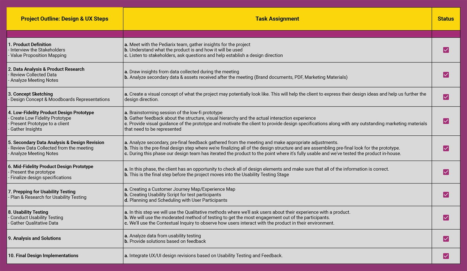
Given the project's considerable scope and impending deadline, meticulous planning of all design stages was essential to ensure alignment with the product release timeline

Understanding The Design Evolution
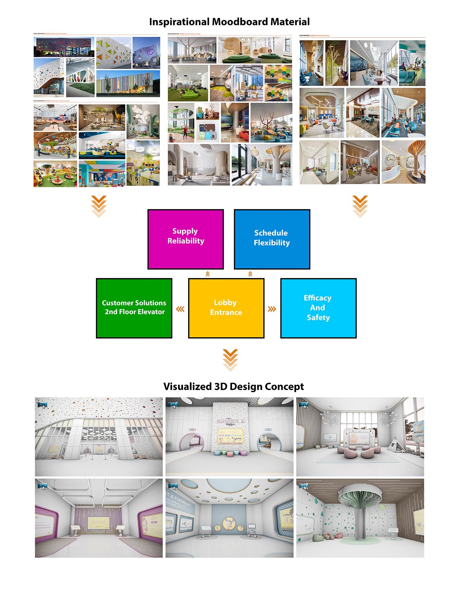
After initial approval of the Moodboard designs, I sifted through various documents and visuals to structure the 3D Interactive Platform’s content. Analysis of data from meetings and user research guided the design direction, leading to a low-fidelity Interactive 3D Prototype for the client. This prototype, subject to ongoing refinement through UX Research and Design Techniques, allowed the client to interact with the future product.

Usability Testing & User Engagement
With the mid-fidelity prototype complete, I began crafting a usability testing script for our chosen participants. To maximize user engagement, I adopted a moderated testing approach. This method allowed for real-time interaction and feedback, providing richer insights. Once the participant interviews were scheduled, the usability testing phase was set in motion. This critical stage allowed us to observe user interactions, gather feedback, and identify areas for improvement.

User Testing & Findings
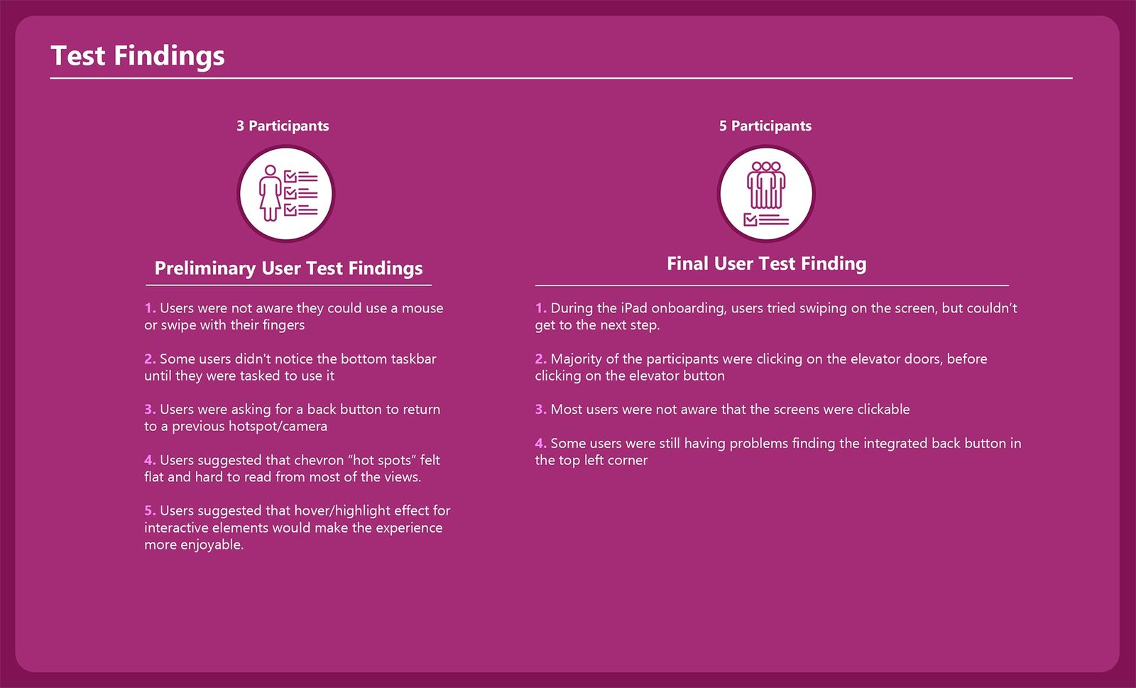
The most insightful research comes directly from the users as they experience the product. If users were unable to complete the onboarding experience or didn’t know how to interact with the product, it would have resulted in a complete failure, undermining the purpose of the 3D interactive platform. Fortunately, due to user product testing, I was able to identify all the pain points and eliminate them before proceeding further into product development.

Data Analysis
To validate my research, I've used a qualitative data approach to gather insights from the usability testing of participants and the observation of their interaction with the prototype.
After sorting through data collected from usability testing, I've identified many important data points that were represented by severity levels to classify which changes had the highest priority.

Interactive Prototype
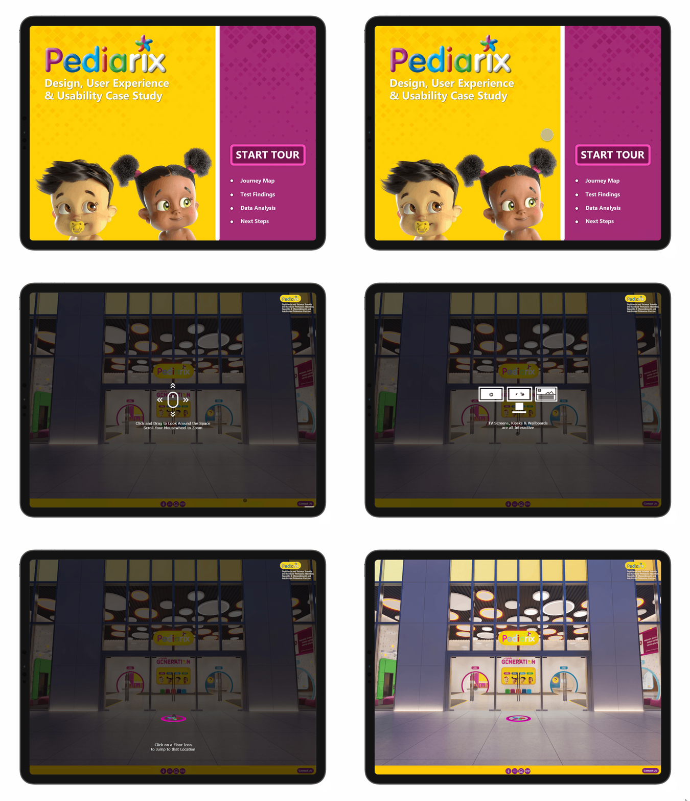
In the process of updating and enhancing the prototype, I encountered numerous software and technical challenges. Despite these setbacks, I managed to overcome most of the hurdles, successfully re-tested the prototype, and integrated all necessary changes. This led to the delivery of the final prototype. For an interactive experience, please click on the animated screen to explore the prototype.

Next Steps
INTERACTIVE MAP:
❖ Create an interactive map in the corner of the screen showing your current location and a compass/person pointing in the direction that the user is facing (similar to google street view)
PULSATING ELEMENTS:
❖ Add a constant, slightly pulsating effect for floor icons to remind the users that the icons are interactive.
❖ Create a pulsating outer glow around clickable elements within the scene to differentiate between static and interactive objects.
UPDATE LOBBY NAVIGATION SCREEN:
❖ The layout and design of buttons needs to be improved
❖ Buttons needs to have an outer pulsating glow and a hover over state
AUTOPLAY ON ALL VIDEO SCREENS:
❖ This will add more engagement and generate an interactive ambiance within the rooms
